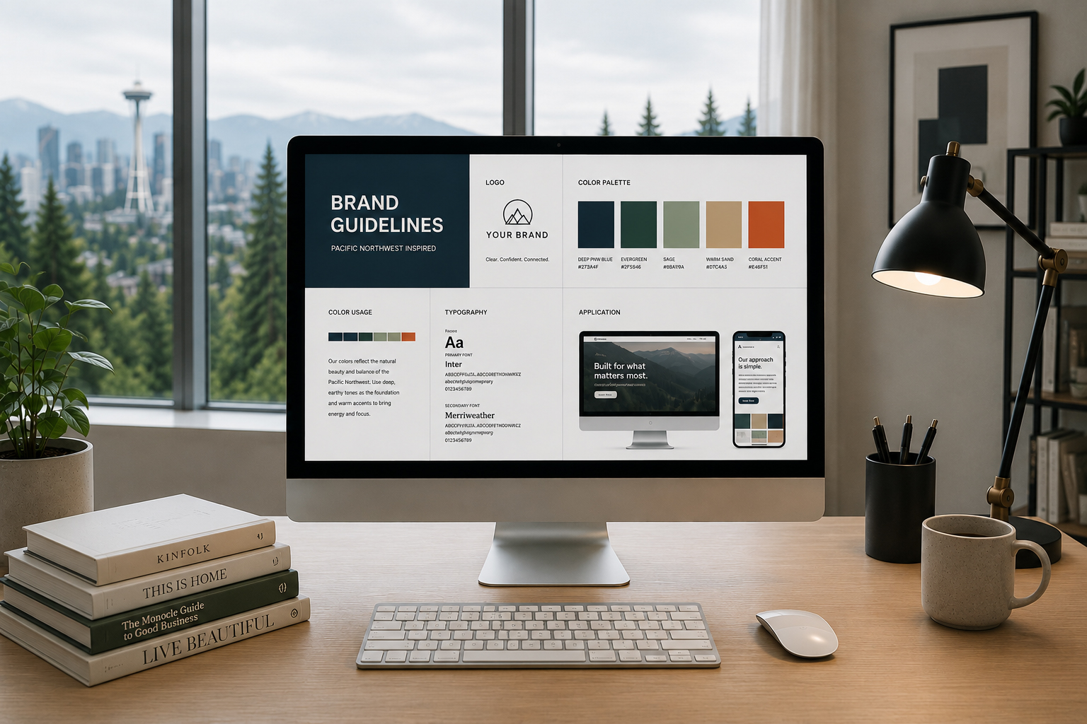
How thoughtful color choices shape recognition, trust, and customer perception.
Color is often one of the first things people notice about a brand. Before they read the headline, understand the service, or explore the website, color has already created an impression.
That impression can feel established or emerging. Calm or energetic. Premium or accessible. Familiar or unexpected. None of those responses comes from color alone, but color helps frame how everything that follows is interpreted.
For Seattle businesses, this matters. The region brings together technology, outdoor culture, healthcare, hospitality, retail, professional services, and a strong creative community. Customers move between these experiences every day. They have learned to notice brands that feel considered—and quickly recognize those that feel interchangeable.
Color psychology in branding is often simplified into formulas: blue means trust, green means nature, red means energy. Those associations can be useful starting points, but strong branding requires more context.
The same blue can make one brand feel credible and another feel predictable. A muted green may suggest sustainability in one setting and quiet sophistication in another. Meaning changes with typography, imagery, contrast, language, industry, and cultural context.
The better question is not, “What does this color mean?” It is, “What does this color help people understand about this brand?”
Color does not define a brand. It helps people recognize what the brand already stands for.
That distinction matters. Choosing colors because they are fashionable may create an attractive identity. Choosing them because they support positioning creates a more useful one.
There is no single “Seattle customer.” Someone evaluating enterprise software has different expectations from someone choosing a restaurant, wellness studio, outdoor brand, or local professional service.
Still, Seattle and the broader Pacific Northwest have a recognizable visual environment. Water, evergreens, mountains, overcast skies, contemporary architecture, technology, and outdoor culture all contribute to how the region looks and feels.
Brands can acknowledge that context without turning every identity into forest green and slate gray. The goal is not to look like Seattle. It is to understand the visual expectations surrounding the people you want to reach.
For many Seattle brands, the strongest palettes tend to balance:
These principles matter more than following a regional color trend.
Blue remains common across technology, healthcare, finance, consulting, and professional services because it can communicate stability, competence, and calm. Those qualities often align well with businesses asking customers to place trust in a service or product.
Seattle's strong technology and enterprise culture makes blue especially familiar. That familiarity can reduce friction. It can also create a differentiation problem. If every competitor uses similar blue gradients, white backgrounds, and geometric typography, trust quickly becomes sameness.
The answer is not necessarily to avoid blue. It is to use it with greater intention. A distinctive secondary palette, warmer photography, unexpected typography, or a carefully controlled accent can make a familiar color system feel ownable.
A color can make you belong to a category. It takes a system to make you memorable within it.
Green has an obvious connection to the Pacific Northwest. It can evoke landscape, sustainability, health, renewal, and balance. For outdoor, wellness, food, environmental, and community-focused brands, those associations can feel particularly relevant.
But green should not become shorthand for “Seattle” or “sustainable.” Customers increasingly expect brands to support environmental positioning through actual behavior, not simply visual language. When the story and the color disagree, the palette can feel cosmetic.
A deeper forest green may feel established and grounded. Sage can feel softer and more wellness-oriented. Brighter greens can introduce energy or innovation. The right choice depends less on a universal psychological meaning and more on the personality the entire brand needs to communicate.
Seattle's visual environment is naturally cool. Gray skies, water, glass architecture, and evergreen landscapes create a subdued backdrop for much of the year. Against that environment, warmer colors can create useful contrast.
Orange, coral, amber, and warmer reds can introduce optimism, movement, appetite, creativity, or approachability. They can work particularly well for hospitality, food, community experiences, consumer brands, and businesses that want to feel more human than institutional.
Warm colors also need control. Too much intensity can shift from energetic to aggressive. A restrained accent often has more impact than covering the entire brand in a high-energy color.
This is where proportion becomes part of color psychology. The question is not only which color to choose. It is also where it appears, how often it appears, and what surrounds it.
Black, charcoal, ivory, cream, stone, and warm gray may appear less expressive at first. In practice, neutral palettes can create some of the strongest brand experiences.
They give typography, photography, products, and ideas room to lead. This is why neutral systems frequently appear in architecture, fashion, premium hospitality, beauty, and design-led businesses. Restraint can communicate confidence when every element has a clear role.
The risk is becoming too quiet. If several competitors use similar minimalist palettes, a brand may look polished but become difficult to remember. A distinctive accent, typography system, image direction, or graphic device can provide the recognition the neutral palette intentionally leaves open.
Minimal does not mean less personality. It means every choice has fewer places to hide.
Brand color does more than create personality. In digital experiences, it also helps people understand what to do.
A primary color may identify the brand, while an accent signals actions. Supporting colors can distinguish information, states, categories, or content. When every color competes for attention, the interface loses hierarchy. When everything looks identical, users have to work harder to understand what matters.
For websites and digital products, color decisions should consider:
Accessibility belongs inside the brand system, not after it. A beautiful palette that makes information difficult to read is not doing its job.
One of the most common branding mistakes happens before any color is selected. Teams begin discussing favorite colors before agreeing on what the brand needs to communicate.
Start with positioning instead. Define the audience, competitive landscape, personality, promise, and experience. Then evaluate which visual choices reinforce those ideas.
A Seattle fintech startup may need to communicate trust without looking institutional. A wellness practice may want calm without becoming generic. A restaurant may need warmth without appearing casual. A creative consultancy may want distinction without sacrificing credibility.
Those are strategic tensions. Color helps resolve them.
Before finalizing a palette, ask:
Those questions produce better branding decisions than choosing colors in isolation.
A palette can look excellent on a brand board and perform poorly in practice. That is why color should be tested where customers will actually experience it.
Apply the system to website pages, social content, presentations, packaging, advertising, signage, and product interfaces where relevant. Look at it on different screens. Test light and dark environments. Review accessibility. See what happens when photography and real content enter the system.
You may discover that the primary color overwhelms large areas. The accent may not have enough contrast for buttons. A neutral that looked sophisticated in isolation may feel cold beside the brand's photography.
Brand systems become stronger when they survive real use.
Color psychology in branding examines how color can influence perception, recognition, and emotional associations. It is most useful when considered alongside brand positioning, audience expectations, typography, imagery, and the broader customer experience.
There is no universal palette for Seattle businesses. The right colors depend on the audience, industry, positioning, and competitive environment. Pacific Northwest influences can provide context, but a brand should not rely on regional clichés to feel relevant.
Blue can work well because it often communicates stability and clarity. However, it is widely used in technology. Seattle tech brands using blue should build enough distinction through tone, typography, secondary colors, imagery, and interaction design.
Most brands benefit from a focused system rather than a large collection. A primary color, supporting colors, neutrals, and one or two functional accents can provide enough flexibility while maintaining consistency. The exact number depends on how complex the brand experience is.
The strongest color systems rarely begin with a trend. They begin with clarity about the brand.
Understand who you are speaking to. Understand the category they are navigating. Decide what should feel familiar and what deserves distinction. Then let color support those decisions across every customer touchpoint.
Seattle customers do not need every local brand to look like the Pacific Northwest. They need brands that understand where they belong—and have enough confidence to look like themselves.
Color gets attention quickly.
What you do with that attention builds the brand.


22525 SE 64th Pl Suite 2345
Issaquah Washington